

Your website is your hardest-working employee. It never calls in sick, never takes holidays, and works around the clock to represent your business. Yet most small Australian businesses treat web design for small businesses as an afterthought, something to tick off a list rather than a genuine investment in their growth. The reality is simpler than you think. You don't need a $15,000 agency build or a degree in code to get this right. You need clarity about what actually matters and the courage to avoid the noise.
What Web Design for Small Businesses Actually Means in 2026
Web design isn't about making things look pretty anymore.
It's about creating a digital asset that converts visitors into customers while representing your brand accurately. The fundamentals haven't changed, but the expectations have. Mobile browsing now accounts for over 63% of web traffic in Australia, which means your site needs to work flawlessly on a phone screen first. Speed matters more than ever, with users abandoning sites that take longer than three seconds to load.
Small business owners often confuse web design with web development. Design is the strategy, the user journey, the visual hierarchy that guides someone from landing on your homepage to completing a purchase or enquiry. Development is the technical execution that brings that design to life.

The Cost of Getting It Wrong
A poorly designed website doesn't just sit there doing nothing. It actively damages your business.
Consider the Melbourne-based homewares retailer who lost $47,000 in revenue over six months because their checkout process had seven steps instead of three. Or the Sydney trades business that spent $8,000 on Google Ads, driving traffic to a website where the contact form didn't work on mobile. These aren't edge cases. They're Tuesday.
The average cost of customer acquisition in Australia has increased by 34% since 2023. When you're paying more to get people to your site, you can't afford to lose them because of clunky navigation or unclear calls to action.
Five Non-Negotiable Elements Every Small Business Website Needs
Strip away the trends and the jargon, and effective web design for small businesses comes down to five core elements.
Clear value proposition. Within three seconds of landing on your homepage, a visitor should understand what you do and why they should care. Not in marketing speak. In plain language that solves a specific problem.
Mobile-first responsive design. Your site needs to adapt seamlessly to every screen size. This isn't optional anymore. Google's mobile-first indexing means the mobile version of your site is what gets ranked in search results. If it breaks on a phone, you're invisible.
Strategic navigation. Visitors should never wonder where to click next. Your menu structure should reflect how people think, not how your business is organized internally. Essential web design principles include limiting main menu items to five or fewer and using descriptive labels instead of clever ones.
Fast load times. Every additional second of load time reduces conversions by 7%. Compress images, minimize code, choose reliable hosting. Speed is a feature, not a technical detail.
Accessible design for all users. Web accessibility compliance protects you legally and expands your potential customer base. Around 18% of Australians live with disability. If your site isn't accessible, you're excluding nearly one in five potential customers.
Platform Choices That Actually Make Sense for Small Australian Businesses
The platform question paralyzes more small business owners than it should.
Shopify dominates Australian eCommerce for good reason. It handles payments, security, hosting, and updates without requiring technical knowledge. The ecosystem of apps means you can add functionality as you grow. For product-based businesses, it removes the technical overwhelm that kills momentum.
WordPress offers more customization but demands more maintenance. WooCommerce can work well if you have development support, but DIY WordPress often becomes a nightmare of plugin conflicts and security vulnerabilities. Wix and Squarespace sit somewhere in the middle, trading flexibility for simplicity.
The right platform depends on your business model and technical comfort. Choosing a website builder requires honest assessment of your capabilities and resources.
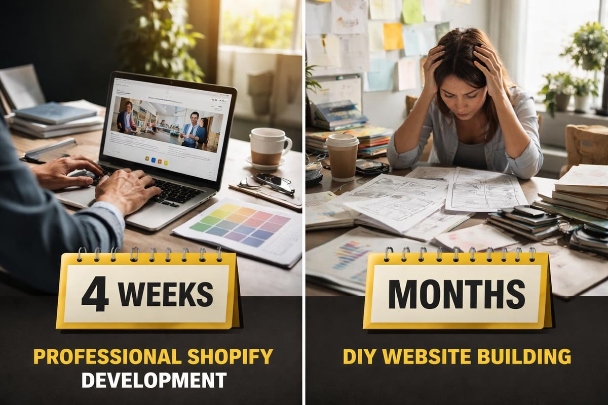
The Real Cost of DIY vs. Professional Development
| Approach | Upfront Cost | Time Investment | Ongoing Maintenance | Scalability |
|---|---|---|---|---|
| Full DIY | $0-$500 | 40-100+ hours | High (self-managed) | Limited |
| Template + Tweaks | $500-$2,000 | 20-40 hours | Medium (some support) | Moderate |
| Professional Build | $3,000-$15,000+ | 10-20 hours | Low (included/managed) | High |
These numbers reflect 2026 Australian market rates. The hidden cost of DIY isn't the subscription fee. It's the opportunity cost of spending 60 hours watching tutorials instead of running your business, plus the revenue lost from a site that doesn't convert properly.
For small eCommerce businesses specifically, Kida Digital’s done-for-you Shopify builds deliver a conversion-focused store within four weeks, covering everything from product setup to payment integration without the agency bloat or the DIY learning curve.
Design Principles That Drive Conversions, Not Just Compliments
Beautiful design that doesn't convert is expensive decoration.
Start with a single clear action on every page. Don't give visitors ten options when one will do. Your homepage should guide people toward the most valuable next step, whether that's viewing products, booking a consultation, or signing up for updates.
Use visual hierarchy to direct attention. Size, color, spacing, and contrast tell users what matters most. Your primary call-to-action button should be impossible to miss. Secondary options should fade into the background. Effective Shopify website design applies these principles across every page template.
White space isn't wasted space. It gives content room to breathe and makes information easier to process. Cramming everything above the fold doesn't work. Users scroll if they're engaged.
Typography and Color Choices That Support Your Brand
Your font choices communicate before anyone reads a word.
Serif fonts (like Times New Roman) suggest tradition and authority. Sans-serif fonts (like Arial or Helvetica) feel modern and clean. Script fonts should be used sparingly if at all. Stick to two or three fonts maximum across your entire site.
Color psychology matters, but clarity matters more. Ensure sufficient contrast between text and background. Light grey text on white backgrounds might look sophisticated, but it's hell to read. Optimizing web color schemes while maintaining accessibility is achievable with the right approach.
Your brand colors should appear consistently across your site, but don't let branding compromise usability. If your brand color is pale yellow, don't use it for body text.
Technical Foundations Most Small Businesses Ignore
SEO isn't something you add after launching. It's built into the foundation.
Page titles, meta descriptions, header tags, and image alt text should be part of your design process, not an afterthought. Every product page, blog post, and service description needs unique, descriptive metadata. SEO optimization strategies require consistent implementation across your entire site structure.
Security certificates (SSL) are mandatory. Google flags non-HTTPS sites as unsafe, and most browsers display warnings that terrify visitors. Every legitimate host includes SSL certificates now. If yours doesn't, change hosts.
Regular backups protect you from catastrophe. Server failures, hacking attempts, and human error all happen. Automated daily backups mean you can restore your site within hours instead of rebuilding from scratch.
Performance Optimization Beyond the Basics
Compressed images make the biggest difference to load times. A 3MB photo straight from your phone will destroy page speed. Resize to display dimensions and compress to under 200KB without visible quality loss.
Lazy loading defers loading images below the fold until users scroll down. It speeds up initial page load without sacrificing content. Most modern platforms include this by default now.
Code minimization removes unnecessary characters from your CSS and JavaScript. The difference between minified and unminified code can be several hundred kilobytes. That adds up across multiple pages.
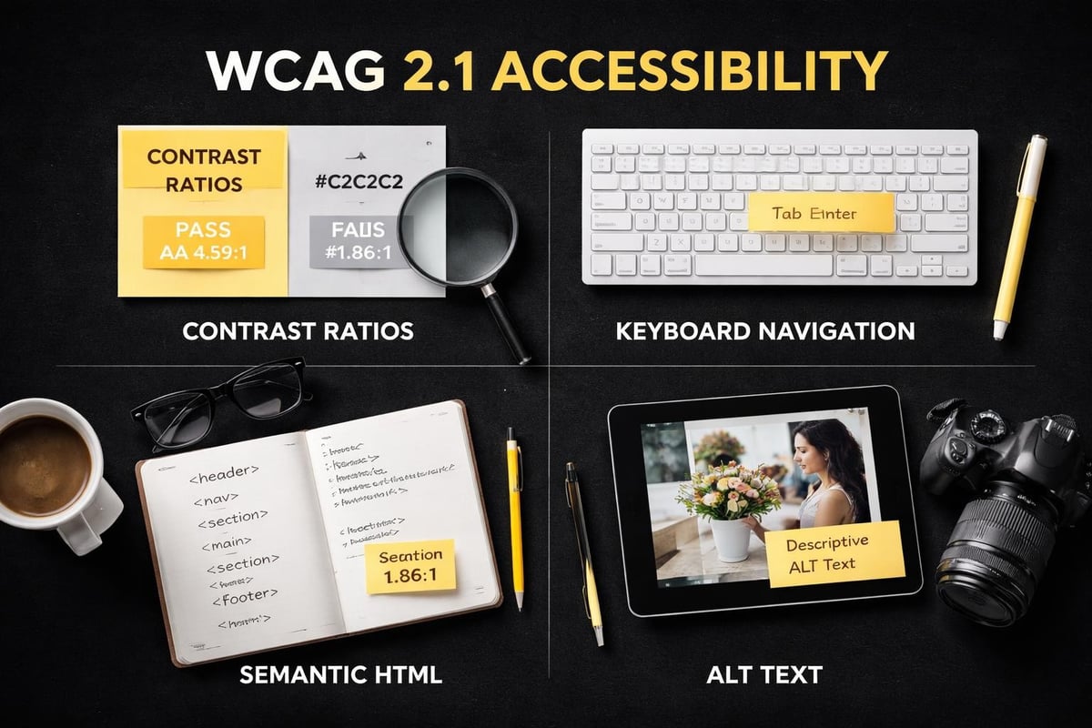
Accessibility Compliance in 2026: Not Optional Anymore
Web accessibility requirements have tightened globally, and Australia is following suit.
The WCAG 2.1 guidelines set the international standard. Level AA compliance is the baseline for most businesses. This means sufficient color contrast, keyboard navigation, descriptive link text, and alternative text for images.
Screen readers help vision-impaired users navigate websites. If your site isn't screen-reader friendly, you're excluding customers and potentially violating disability discrimination laws. Proper heading hierarchy (H1, H2, H3) helps screen readers understand page structure.
Captions for video content aren't just for deaf users. They benefit anyone watching in sound-sensitive environments or non-native English speakers. Auto-generated captions need manual review for accuracy.
Testing Your Site for Accessibility Violations
Automated tools catch about 30-40% of accessibility issues. They're a starting point, not a complete solution.
Manual testing reveals problems automated scans miss. Try navigating your entire site using only a keyboard (no mouse). Every interactive element should be reachable and usable. Tab order should follow a logical sequence.
Hire users with disabilities to test your site. Their feedback identifies real-world barriers that technical audits overlook. Budget $500-$1,000 for proper user testing with diverse participants.
Content Strategy: What to Say and Where to Say It
Every page needs a purpose that serves both users and business goals.
Your homepage introduces your business and directs traffic to key areas. Product or service pages provide enough information to support purchase decisions without overwhelming. About pages build trust through authentic storytelling, not corporate fluff.
Blog content supports SEO strategy while demonstrating expertise. Answer the questions your customers actually ask. Search data and customer support tickets reveal what people want to know.
Contact information should appear on every page, preferably in the header or footer. Making people hunt for ways to reach you signals that you don't actually want their business.
Writing for Humans and Search Engines Simultaneously
Keywords matter, but keyword stuffing kills conversions.
Write naturally first, then optimize. Your primary keyword should appear in the page title, first paragraph, at least one heading, and a few times throughout the body content. Forcing it into every sentence makes your copy unreadable.
Answer search intent before selling. If someone searches "how to choose running shoes," they want education, not a sales pitch. Provide genuine value first, then naturally transition to your products or services.
Short sentences improve readability. One thought per sentence keeps things clear. Complex ideas need breaking down into digestible pieces. Aim for 8th-grade reading level unless your audience specifically demands technical language.
Maintenance and Evolution: Websites Are Never Finished
Launch is the beginning, not the end.
Plan to review and update content quarterly. Products change, services evolve, contact details shift. Outdated information damages credibility faster than no website at all.
Monitor analytics weekly to understand user behavior. Which pages do people visit most? Where do they drop off? What paths do they take through your site? Data reveals opportunities that assumptions miss.
Test changes systematically. Don't redesign your entire site based on a hunch. A/B test one element at a time: headlines, button colors, form fields, page layouts. Small improvements compound over time.
When to Refresh vs. Rebuild
Minor refreshes every 12-18 months keep things current without major disruption. Update images, refine copy, adjust layouts, add new features.
Full rebuilds typically make sense every 3-5 years or when:
- Your platform becomes obsolete or unsupported
- Your business model changes significantly
- Performance issues can't be fixed without structural changes
- Design trends have shifted enough that your site looks genuinely dated
Rebuilding too frequently wastes money and confuses customers. Waiting too long means falling behind competitors and losing revenue to poor user experience.
Common Web Design Mistakes That Cost Australian Small Businesses Money
Auto-playing videos annoy more people than they engage. They spike bandwidth usage on mobile, drain battery life, and disrupt concentration. If you must include video, make it click-to-play.
Cluttered homepages trying to showcase everything achieve nothing. Pick one primary focus and two secondary focuses maximum. Everything else can live on dedicated pages.
Forms asking for unnecessary information reduce completion rates. Every additional field decreases conversions by an average of 11%. Ask only what you genuinely need.
Generic stock photos signal that you don't care about authenticity. Invest in real product photography and team photos. Smartphone cameras in 2026 are good enough for most small business needs.
Web design for small businesses in 2026 isn't about chasing trends or matching competitor features. It's about building a conversion-focused digital asset that represents your brand accurately while making it effortlessly easy for customers to do business with you. Whether you're launching your first online store or ready to move beyond a DIY build that isn't performing, Kida Digital helps small Australian eCommerce businesses build conversion-led Shopify stores from concept to launch in four weeks, without the agency bloat or the technical overwhelm.


Be the first to comment