

Your customers browse on phones during lunch breaks, tablets on the couch, and desktops at work. If your Shopify store looks broken on any of these devices, you're losing sales before they even start. Responsive website design isn't a nice-to-have feature anymore-it's the baseline expectation for every online shopper in 2026. For small Australian eCommerce businesses, getting this right directly impacts your conversion rate, customer trust, and ultimately your revenue.
Why Responsive Design Matters More Than Ever
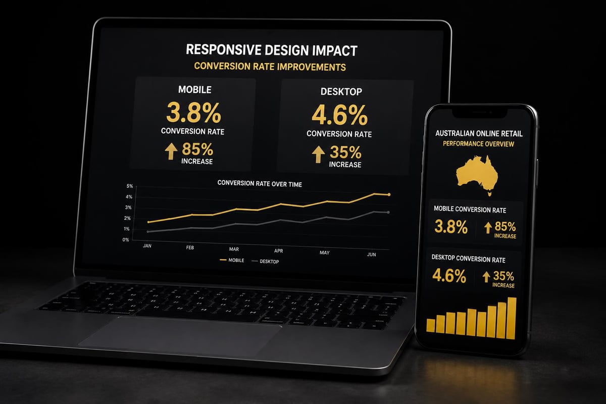
Mobile commerce now accounts for over 70% of eCommerce traffic in Australia.
That number climbs higher every quarter.
Your potential customers expect seamless experiences regardless of screen size. When a site doesn't load properly on mobile, 57% of users won't recommend that business. They simply leave and buy from a competitor whose site works.
The financial impact is immediate:
- Poorly responsive sites see bounce rates increase by 40-60%
- Mobile-optimized stores convert 2.5x better than non-optimized versions
- Google penalizes non-responsive sites in search rankings, reducing organic traffic
Responsive website design solves these problems by creating flexible layouts that adapt automatically to different screen sizes. The same HTML and CSS code serves all devices, adjusting typography, images, navigation, and content hierarchy based on viewport width.
This approach differs fundamentally from maintaining separate mobile and desktop sites. One codebase means easier updates, consistent branding, and lower maintenance costs. For small businesses running lean operations, that efficiency matters enormously.
Core Principles That Actually Work
Responsive website design relies on three technical foundations that work together seamlessly.
Fluid Grid Layouts
Traditional fixed-width designs break when screens shrink or expand. Fluid grids use percentage-based widths instead of pixels, allowing content containers to resize proportionally. A three-column desktop layout gracefully becomes two columns on tablets and stacks vertically on phones.
CSS Grid and Flexbox provide the tools to build these flexible structures. Modern browsers support both, making implementation straightforward for developers who understand the underlying principles.
Flexible Images and Media
Images that work beautifully at 1920px wide become unusable monsters on 375px mobile screens. Responsive images scale within their containers, never exceeding the viewport width.
The srcset attribute serves different image sizes based on screen resolution and pixel density. Retina displays get high-resolution versions while older devices load lighter files. This optimization reduces page weight on mobile networks where every kilobyte affects load time.
Video embeds require similar treatment. Fixed-width iframes break responsive layouts, but CSS can make them adapt using aspect ratio techniques.
Media Queries for Breakpoints
Media queries detect viewport characteristics and apply specific CSS rules accordingly. A breakpoint at 768px might trigger layout changes between tablet and desktop views.
Best practices recommend starting with mobile-first media queries, writing base styles for small screens and progressively enhancing for larger devices. This approach ensures solid mobile experiences while adding desktop features as bonuses.
Common breakpoints typically cluster around:
- 320px for small phones
- 768px for tablets
- 1024px for laptops
- 1440px for large desktops
However, the IEEE standards suggest focusing on content-driven breakpoints rather than device-specific dimensions. Your layout should break when the design demands it, not at arbitrary pixel widths.
Navigation Patterns That Convert
Mobile navigation presents unique challenges for eCommerce stores with extensive product catalogues.
Desktop mega-menus become unusable vertical nightmares on phones. Your customers need quick access to categories, search, cart, and account without wrestling complex dropdowns.
The hamburger menu remains standard for mobile, despite ongoing debates about discoverability. When implemented properly with clear icons and smooth animations, users understand how to access full navigation instantly.
Priority-plus navigation offers another solution. Display high-value categories directly in the header while hiding secondary links under a "more" button. This hybrid approach works particularly well for Australian businesses with focused product ranges.
Bottom navigation bars have gained traction for mobile eCommerce. Placing cart, search, categories, and account icons at the bottom makes them thumb-friendly on larger phones. Shopify's mobile app uses this pattern effectively.
Sticky headers keep navigation accessible as users scroll through long product pages. This pattern increases engagement by 20-30% according to multiple case studies, though it consumes valuable screen real estate.
The right choice depends on your specific catalogue structure and customer browsing behaviour. When building Shopify stores from scratch, testing different navigation patterns with real users reveals which approach converts best for your audience.
Typography and Readability Across Devices
Text that looks perfect at desktop scale becomes microscopic on mobile screens.
Responsive website design requires careful attention to font sizing, line height, and text block width across all viewports.
Minimum mobile font sizes should start at 16px for body text. Anything smaller forces users to pinch-zoom, creating friction that kills conversions. Headings can scale larger proportionally using relative units like rem or em.
Line height matters more than many designers realize. Desktop optimal line-height sits around 1.5, but mobile screens often benefit from slightly tighter 1.4 spacing to reduce vertical scrolling.
Text block width affects reading comfort significantly. Lines containing 50-75 characters read easiest, regardless of screen size. Responsive layouts should constrain text width even on wide monitors, preventing exhausting eye movement across 20-inch displays.
| Screen Size | Body Font | H2 Font | Max Width |
|---|---|---|---|
| Mobile | 16px | 24px | 100% |
| Tablet | 17px | 28px | 90% |
| Desktop | 18px | 32px | 720px |
Contrast ratios between text and background must meet WCAG standards across all screen sizes. What works in desktop design sometimes fails when viewed on mobile devices in bright sunlight.
Image Optimization and Performance
Page speed directly correlates with conversion rates in eCommerce.
Amazon found that every 100ms of load time cost them 1% in sales. Your small Australian store can't afford to ignore performance, especially on mobile networks where 4G remains inconsistent outside metro areas.
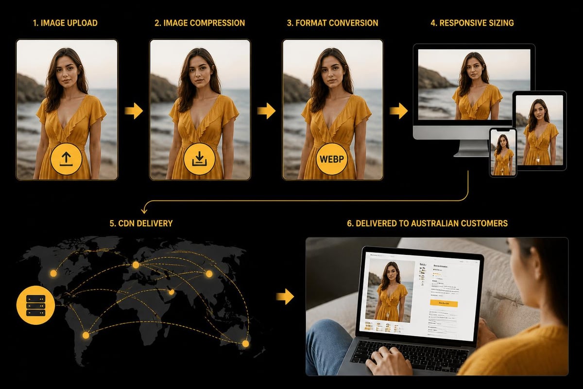
Images typically account for 60-80% of page weight. Responsive website design must address this reality through multiple optimization strategies working together.
Modern image formats reduce file sizes dramatically:
- WebP provides 25-35% smaller files than JPEG with comparable quality
- AVIF goes further with 50% size reductions in many cases
- Progressive JPEGs render faster by showing low-quality versions first
Lazy loading defers off-screen images until users scroll near them. This technique cuts initial page load by 40-60% on product pages with multiple images. Native browser lazy loading now works without JavaScript using the simple loading="lazy" attribute.
Content delivery networks (CDNs) serve images from geographically distributed servers. Australian shoppers loading from Sydney servers see dramatically faster response times than pulling images from US-based hosting.
Shopify handles much of this automatically through its built-in CDN and image optimization, though understanding the underlying principles helps you make better decisions about custom image implementations.
Touch Targets and Mobile Interactions
Desktop users have precise mouse cursors. Mobile users have thumbs that cover 44-57 CSS pixels.
This fundamental difference demands different interaction design. Buttons, links, and form inputs need adequate sizing and spacing to prevent frustrated mis-taps.
Apple's Human Interface Guidelines recommend minimum touch target sizes of 44×44 pixels. Google suggests 48×48 pixels. Meeting these standards prevents accessibility issues and reduces cart abandonment from interface frustration.
Spacing between interactive elements matters equally. Two small buttons placed too close become impossible to tap accurately. Generous whitespace around clickable elements improves usability without cluttering designs.
Hover states don't exist on touchscreens. Designs relying on hover to reveal critical information fail mobile users completely. Important actions and content must be visible by default or triggered through taps, not hover interactions.
Form inputs require special attention in responsive website design. Mobile keyboards consume half the screen, making long forms particularly painful. Progressive disclosure, where forms reveal fields as needed, reduces cognitive load and completion time.
Testing Across Real Devices
Browser DevTools provide convenient responsive preview modes. They're helpful for initial development but insufficient for final validation.
Real devices reveal problems that simulators miss. Touch interactions, performance characteristics, font rendering, and network conditions all behave differently on actual phones and tablets.
Effective testing strategies combine multiple approaches:
- Physical device labs with popular Australian models (iPhone 14/15, Samsung Galaxy S23/24, iPad)
- Cloud testing platforms like BrowserStack for broader device coverage
- Real user monitoring tools that capture actual customer experiences
- Analytics data showing which devices your specific audience uses most
Focus testing on devices your customers actually use. Google Analytics reveals which phones, tablets, and screen sizes drive your traffic. Optimize aggressively for those configurations while ensuring basic functionality across all devices.
Performance testing matters enormously. A site that looks perfect but loads slowly fails responsive design goals. Test on 3G networks to simulate challenging conditions many Australian regional customers face.
GeeksForGeeks outlines comprehensive testing practices covering viewport testing, cross-browser validation, and performance benchmarking that small businesses can implement without enterprise budgets.
Common Pitfalls to Avoid
Many responsive implementations look good on paper but fail in practice.
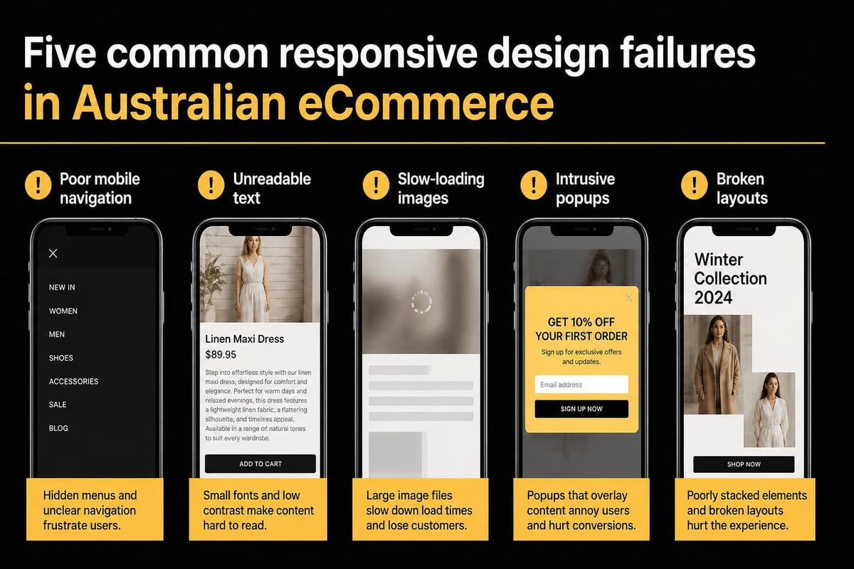
Hidden mobile navigation that requires too many taps frustrates users. Three levels deep before reaching products kills conversion. Flatten your information architecture for mobile experiences.
Tiny text requiring zoom creates immediate abandonment. Some designers assume users will zoom naturally, but studies show they simply leave instead. Start with readable sizes and scale up for larger screens.
Oversized images waste mobile data and slow load times unnecessarily. Serving desktop-resolution images to phones shows disrespect for your customers' data plans and patience.
Pop-ups and interstitials become particularly obnoxious on mobile. Full-screen overlays that work acceptably on desktop completely block mobile content. UXPin documents how intrusive modals damage mobile user experience and conversion rates.
Fixed positioning elements (headers, footers, chat widgets) consume excessive screen real estate on small viewports. That convenient desktop chat button becomes an obstructive nightmare covering product details on phones.
Horizontal scrolling almost always indicates broken responsive implementation. Unless deliberately designed for image galleries, horizontal scroll suggests the layout isn't truly responsive.
Mobile-First Design Philosophy
Starting with mobile layouts and enhancing for desktop reverses traditional workflows.
This approach forces prioritization of essential content and functionality. When you design for constrained mobile screens first, only the most important elements make the cut.
Desktop designs often bloat with unnecessary features because the space exists. Mobile-first thinking creates leaner, more focused experiences that convert better across all devices.
The technical implementation reflects this philosophy through progressive enhancement. Write baseline CSS for mobile, then use media queries to add complexity for larger screens. This strategy ensures solid mobile experiences even when CSS fails to load completely.
Mobile-first also aligns with indexing and SEO priorities. Google predominantly uses mobile versions for ranking since 2021. Sites that deliver excellent mobile experiences rank better in search results, driving more organic traffic.
For small Australian eCommerce businesses, mobile-first responsive design directly impacts your visibility and conversion rates from day one. When launching new Shopify stores, building mobile-first ensures you're not retrofitting responsiveness later, which costs more and delivers worse results.
Performance Budgets and Load Times
Fast sites convert better. This truth holds across every study, region, and industry.
Setting performance budgets establishes clear targets for page weight, load time, and time to interactive metrics. These constraints guide development decisions and prevent performance degradation over time.
A reasonable mobile performance budget might specify:
- Total page weight under 1MB
- First Contentful Paint under 1.8 seconds
- Time to Interactive under 3.5 seconds
- Largest Contentful Paint under 2.5 seconds
Modern development tools make monitoring these metrics straightforward. Lighthouse audits in Chrome DevTools provide instant feedback on performance, accessibility, and SEO factors.
Third-party scripts and apps often torpedo performance budgets. Each marketing pixel, analytics tool, and review widget adds weight and execution time. Audit ruthlessly and remove anything not directly contributing to conversions.
Shopify's app ecosystem makes adding functionality tempting, but every app impacts load time. Choose carefully, prioritizing lightweight solutions and removing unused apps regularly.
Critical CSS techniques inline essential styles in the HTML head, rendering above-fold content immediately while loading full stylesheets asynchronously. This optimization dramatically improves perceived performance.
Shopify-Specific Responsive Considerations
Shopify themes handle basic responsive website design automatically.
However, customization and app integration can break responsive behaviour if not implemented carefully.
Theme sections and blocks should maintain responsive integrity when rearranged. Test thoroughly after adding custom sections or modifying existing layouts.
Product page templates require special attention. Multiple images, variant selectors, descriptions, reviews, and related products must all work seamlessly across devices. Mobile product pages often need simplified layouts compared to desktop versions.
Collection pages present similar challenges. Grid layouts that show five products per row on desktop should gracefully reduce to two or one column on mobile without breaking spacing or alignment.
Cart and checkout experiences demand flawless mobile responsiveness. Any friction during checkout directly impacts completion rates. Shopify's native checkout handles responsiveness well, but customizations need careful testing.
When working with developers on done-for-you Shopify builds, ensure responsive design testing occurs throughout development, not just at the end. Catching responsive issues early prevents costly revisions and launch delays.
Future-Proofing Your Responsive Strategy
Technology evolves constantly, but core responsive principles remain stable.
New device categories emerge regularly. Foldable phones, smart watches, and other form factors will require consideration. Building on solid responsive foundations makes adapting to new screens manageable.
Variable fonts provide better typography control while reducing file sizes. They allow multiple weights and styles within single font files, improving both design flexibility and performance.
Container queries represent the next evolution of responsive design, allowing components to respond to their container size rather than viewport width. Research into modular responsive approaches shows how this enables more flexible, component-based designs.
Progressive web app capabilities blur lines between websites and native apps. Responsive website design integrates naturally with PWA features, creating app-like experiences through responsive web technologies.
Your responsive strategy should balance current best practices with flexibility for emerging technologies. Avoid over-engineering for hypothetical future scenarios while building on standards-based approaches that adapt naturally.
Measuring Responsive Design Success
Analytics reveal how responsive implementations perform in reality.
Track mobile versus desktop conversion rates separately. Significant gaps indicate responsive design problems affecting one platform more than the other.
Key metrics to monitor include:
- Mobile bounce rate compared to desktop
- Page load times across device categories
- Form completion rates on mobile versus desktop
- Cart abandonment by device type
- Revenue per session across platforms
Google Analytics 4 provides device category reporting out of the box. Segment all major metrics by device to understand performance differences.
Heatmaps and session recordings from tools like Hotjar or Microsoft Clarity show exactly how mobile users interact with your responsive design. These qualitative insights reveal friction points that raw numbers miss.
Core Web Vitals specifically measure user experience factors Google considers for rankings. Monitor these metrics monthly and investigate when scores decline.
A/B testing different responsive implementations provides concrete data about what works. Test navigation patterns, image sizing strategies, or layout approaches to optimize systematically rather than guessing.
Responsive website design forms the foundation of successful Australian eCommerce in 2026. Getting it right improves your conversion rates, customer satisfaction, and search rankings simultaneously. If you're launching a new Shopify store or need to optimize an existing one, Kida Digital specializes in building conversion-focused, fully responsive stores for small Australian eCommerce businesses. We handle everything from strategy to launch in four weeks, ensuring your responsive design works flawlessly across every device your customers use.


Be the first to comment