
Showit template customisation offers small Australian businesses a practical middle ground between expensive custom design and generic DIY solutions. The platform's drag-and-drop flexibility means you can purchase a professionally designed template and reshape it to reflect your brand without needing to code. But there's a gap between buying a template and actually making it yours. Most businesses get stuck between preserving the original design integrity and expressing their unique brand identity. This guide walks through the strategic approach to customising Showit templates, focusing on decisions that matter for conversion and brand recognition rather than endless tweaking.
Understanding the Foundation Before You Start
Starting with a clear plan saves weeks of back-and-forth adjustments.
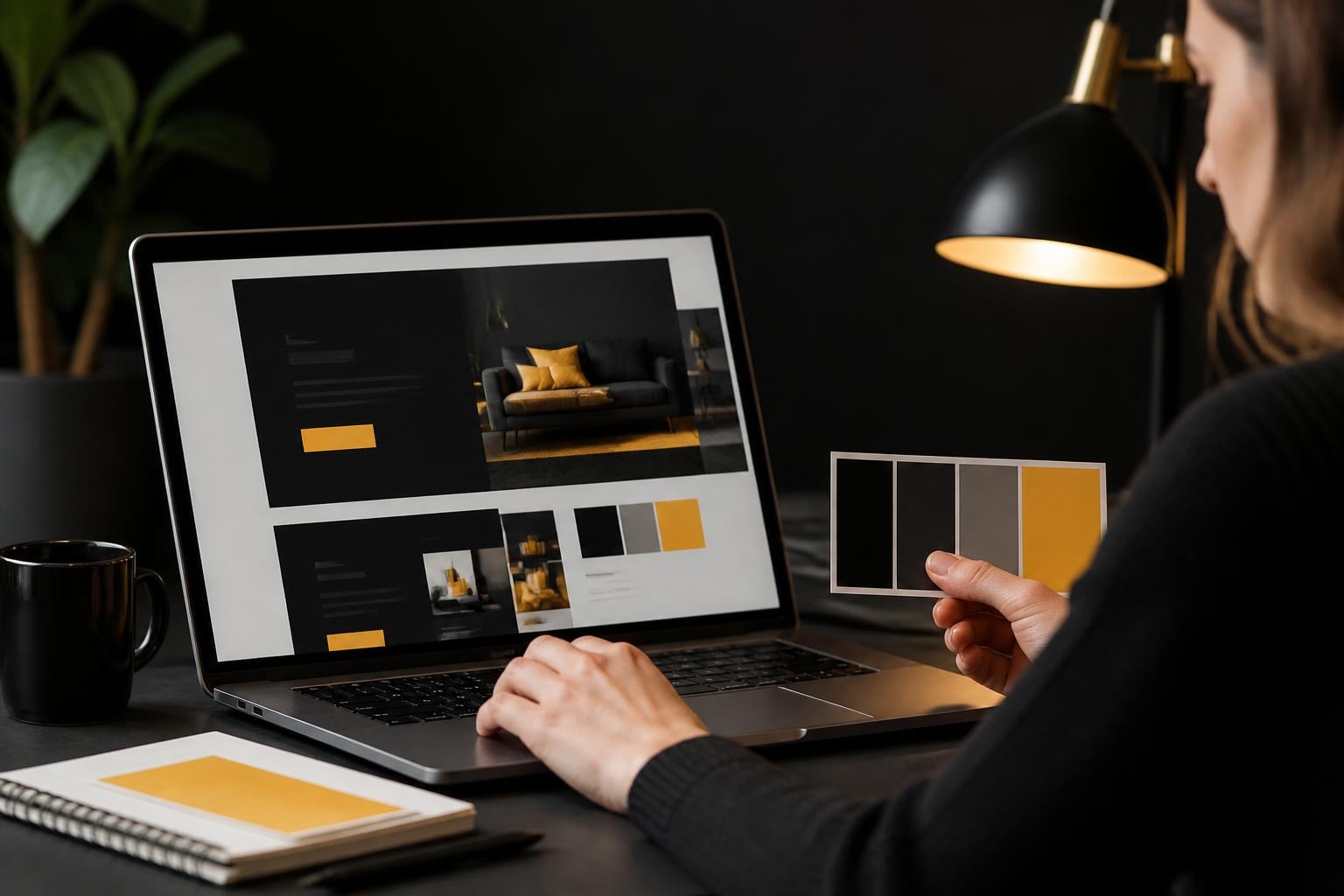
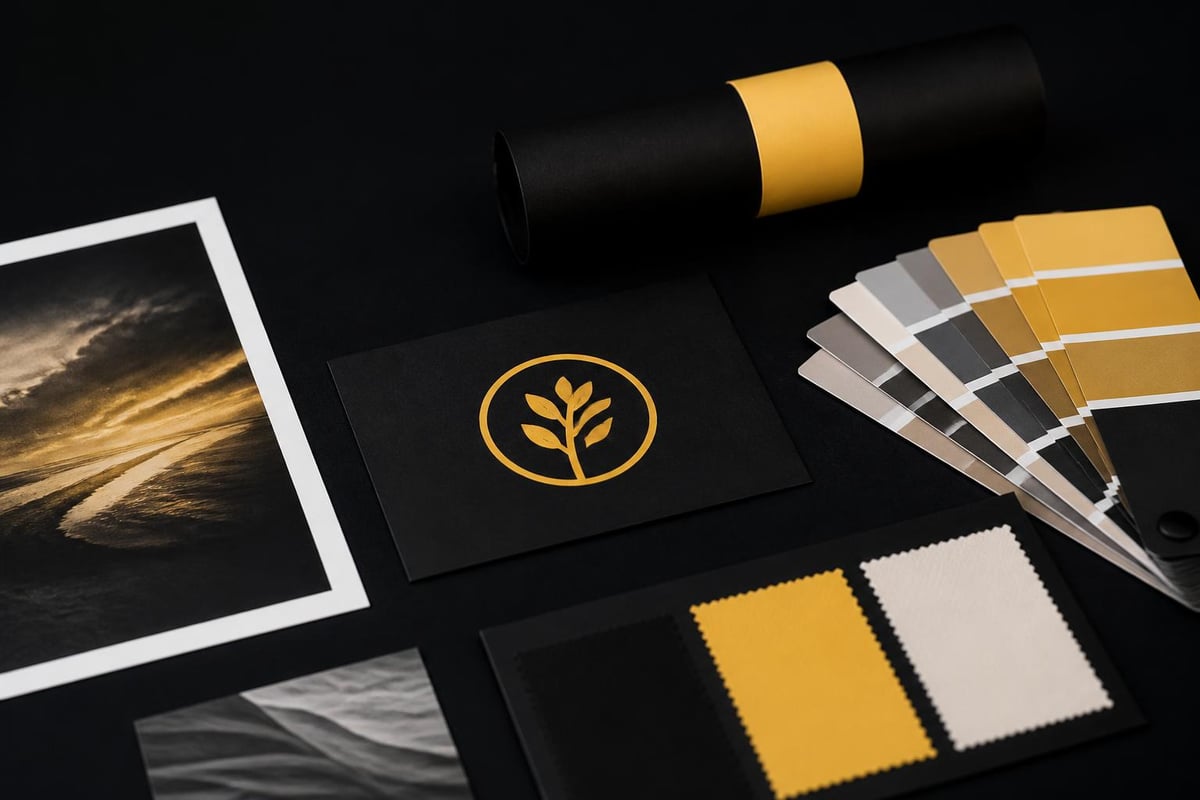
Before touching any design elements, gather your brand assets in one place. You'll need your logo files in multiple formats, your complete colour palette with hex codes, and any custom fonts you're using. Many businesses skip this step and end up making inconsistent choices throughout the customisation process.
Your brand guidelines should include:
- Primary and secondary colour palettes with specific hex values
- Typography hierarchy showing headings, body text, and accent fonts
- Logo variations for different backgrounds and sizes
- Image style preferences that define your visual language
- Spacing and padding standards that create visual rhythm
The six-step customisation process outlined by design professionals emphasises preparation as the foundation for efficient execution. When you know exactly what you're working with, decisions become faster and more confident.
Mapping Your Content to Template Structure
Templates are designed with generic content structures that may not match your business model.
Review each page of your purchased template and note where your actual content differs from the placeholder structure. An eCommerce business selling physical products needs different sections than a service provider or digital product creator. This is where many businesses waste time trying to force their content into unsuitable layouts.
Create a simple mapping document showing what content goes where. This prevents the common mistake of keeping template sections just because they exist, even when they don't serve your business goals.
Strategic Design Decisions That Impact Conversion
Showit template customisation becomes powerful when you make deliberate choices based on your customer journey.
Colour psychology plays a measurable role in eCommerce conversion rates. Research from studies on consumer behaviour shows that up to 85% of purchasing decisions are influenced by colour. Don't just pick colours you like. Choose colours that align with your product category and target audience expectations.
| Design Element | Low-Impact Change | High-Impact Change |
|---|---|---|
| Colours | Adjusting shade slightly | Complete palette replacement |
| Typography | Font size adjustments | Changing font families |
| Layout | Moving sections vertically | Restructuring navigation |
| Images | Swapping similar photos | Changing photography style |
| Spacing | Minor padding tweaks | Section width modifications |
The table above shows which customisation decisions create noticeable brand differentiation versus subtle refinements. Focus your energy on high-impact changes first.
Typography Choices That Build Brand Recognition
Font selection influences readability and brand personality more than most businesses realize.
Showit allows custom font uploads, giving you freedom beyond Google Fonts. However, using more than three font families creates visual chaos. The standard approach uses one font for headings, one for body text, and occasionally a third for accents or special callouts.
Consider loading speed when selecting fonts. Custom fonts add page weight, which impacts your site performance scores. This matters for both user experience and search rankings.
Test your font combinations at different screen sizes before committing. What looks elegant on desktop might become illegible on mobile. Understanding how to implement custom fonts properly ensures your typography enhances rather than hinders the user experience.
Layout Modifications Without Breaking Design Integrity
The drag-and-drop nature of Showit makes layout changes tempting but risky.
Templates are built with intentional spacing, alignment, and visual hierarchy. When you start moving elements freely, you can easily break these relationships. The key is understanding why elements are positioned where they are before relocating them.
Professional designers balance three layout principles:
- Visual hierarchy guiding eyes to important elements first
- White space providing breathing room between sections
- Alignment creating clean edges and professional polish
Before moving any element, take a screenshot of the original layout. This gives you a reference point if your changes reduce visual clarity. Many businesses improve one section while unknowingly degrading another part of the page.
Creating custom layouts while maintaining design consistency requires understanding these underlying principles rather than just moving boxes around.
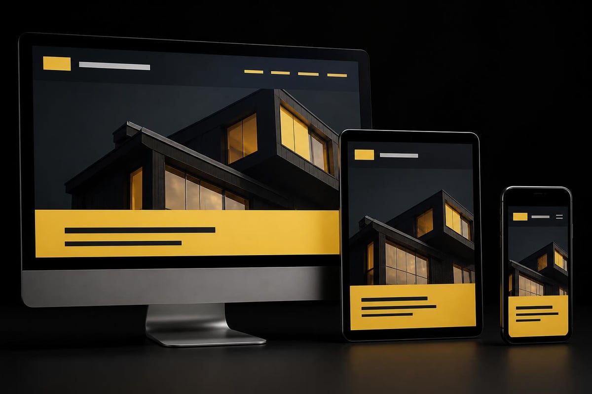
Mobile Responsiveness During Customisation
Showit offers separate mobile editing, but this doubles your customisation work.
Every change you make on desktop needs consideration for mobile display. Text that fits perfectly in a desktop hero section might require three screens of scrolling on mobile. Images that look stunning at 1920px width might lose all impact when compressed to 375px.
Test mobile views continuously throughout your customisation process. Don't wait until you've finished desktop design to discover your mobile experience is broken. This reactive approach leads to either settling for poor mobile design or redoing hours of work.
Content Integration That Reflects Your Voice
Template placeholder text never matches your business reality.
The fastest way to make a template feel generic is keeping lorem ipsum or generic marketing copy. Your words are often more distinctive than your visual design choices. Write content that reflects how you actually communicate with customers, not how the template designer imagined communication.
Replace every piece of text, including:
- Navigation labels specific to your offerings
- Headline formulas that match your customer language
- Call-to-action buttons using your conversion framework
- About section telling your actual story
- Service or product descriptions in your voice
Many Australian small businesses struggle with this step because they underestimate the strategic value of copywriting. Strong eCommerce foundations require content that connects with your specific audience, not generic industry speak.
Image Selection and Brand Consistency
Stock photos are the fastest way to make your customised template look like everyone else's.
Invest in custom photography or carefully curated stock images that share consistent characteristics. This means similar lighting, colour temperature, composition style, and subject matter across all images. Mixing photography styles creates visual discord that undermines your professional appearance.
If custom photography isn't in your budget yet, platforms like Unsplash offer free stock photos. The trick is selecting images from the same photographer or with matching aesthetic qualities. Create an image board before uploading anything to ensure visual consistency.
Maintaining consistent image proportions throughout your template prevents layout breaks and maintains the designer's intended visual rhythm.
Blog Template Customisation for Content Marketing
Showit integrates with WordPress for blog functionality, creating unique customisation requirements.
Your blog template needs to work for multiple post types and content formats. A product review post requires different layout elements than a how-to tutorial or company update. Setting up custom WordPress pages within Showit allows you to create these variations while maintaining design consistency.
Essential blog customisation elements include:
- Featured image display that matches your content imagery
- Author bio sections for team members if relevant
- Related posts modules for content discovery
- Social sharing buttons positioned strategically
- Category navigation helping readers find relevant content
The global blog template feature lets you design once and apply consistently across all posts. This saves enormous time compared to manually formatting every blog entry.
Consider your content strategy when customising blog templates. If you plan video content, ensure your template accommodates embedded media. If you're focusing on long-form guides, optimize for reading comfort with appropriate line length and spacing.
Navigation Structure and User Journey
Template navigation rarely matches your specific customer journey.
Map out how customers naturally progress through your offerings before customising menu structure. An eCommerce store selling consumable products needs different navigation than one selling high-consideration purchases. Your menu should guide users toward conversion, not just organize information.
Primary navigation works best with five to seven main items. Beyond this, decision fatigue reduces click-through rates. Use dropdown menus sparingly as they add friction on mobile devices.
| Navigation Type | Best For | Conversion Impact |
|---|---|---|
| Horizontal Top Menu | Service businesses, portfolios | Moderate |
| Hamburger Mobile Only | Content-heavy sites | Low on desktop, necessary mobile |
| Mega Menu | Large product catalogues | High when well-organized |
| Sticky Header | Long scrolling pages | High for engagement |
| Footer Navigation | Legal/support links | Low direct impact |
Test your navigation decisions with real users before launching. What seems logical to you might confuse someone unfamiliar with your business.
Call-to-Action Placement Strategy
Templates include CTAs in generic locations that may not align with your conversion goals.
Analyze where your customers need encouragement to take action. For some businesses, this happens early after establishing credibility. For others, it requires extensive education first. Your showit template customisation should position CTAs based on your customer's decision-making process, not just design aesthetics.
Multiple CTA variations throughout a page can increase conversion rates by 232% according to conversion optimization studies. Don't rely on a single contact form at the bottom of your page.
Technical Customisation Considerations
Design changes affect site performance, which impacts both user experience and search rankings.
Every custom element you add increases page load time. High-resolution images, custom fonts, animation effects, and embedded media all contribute to slower performance. Google's Core Web Vitals treat loading speed as a ranking factor, making this more than just a user preference issue.
Compress images before uploading to Showit. Tools like TinyPNG reduce file sizes by 70% without visible quality loss. This single step dramatically improves page speed scores.
Limit custom font files to only the weights you actually use. Loading an entire font family with eight weights adds unnecessary bulk when you only use regular and bold.
Understanding template development fundamentals from an eCommerce perspective shows how technical decisions integrate with design choices for optimal performance.

Brand Differentiation Through Subtle Details
Small customisation choices compound into distinctive brand presence.
Button styling, form field design, hover effects, and transition animations might seem minor individually. Together, they create the micro-interactions that define user experience quality. Template defaults work functionally but don't build brand memory.
Consider button rounded corners as an example. Sharp corners communicate precision and modernity. Fully rounded buttons suggest approachability and friendliness. Slight rounding balances both qualities. This tiny decision reinforces brand personality with every click.
Detail-level customisation opportunities:
- Input field border styles and focus states
- Button hover animations and colour transitions
- Link underline styles and hover behaviours
- Section divider designs and spacing
- Loading animations and transition effects
Implementing these refinements thoughtfully separates professional execution from rushed template deployment.
Maintaining Design Consistency Across Pages
Template customisation often focuses on the homepage while secondary pages get minimal attention.
Your contact page, about page, and service pages deserve the same customisation care as your homepage. Inconsistent design across pages signals incomplete development and damages credibility. Customers notice when your about page looks like a different website than your homepage.
Create design standards for recurring elements that appear across multiple pages. This includes section headers, content blocks, image treatments, and spacing patterns. Document these standards so you maintain consistency as you customize each page.
Testing Your Customisation Before Launch
No customisation is complete without thorough testing across scenarios.
View your site in multiple browsers: Chrome, Safari, Firefox, and Edge all render designs slightly differently. Test on actual mobile devices, not just browser preview modes. Real phones reveal touch target issues and scrolling behaviours that desktop testing misses.
Check all interactive elements:
- Forms submit correctly and send notifications
- Links direct to intended destinations
- Buttons trigger appropriate actions
- Navigation works on all devices
- Media loads and plays properly
Ask someone unfamiliar with your business to complete a typical customer journey on your customised site. Their confusion reveals navigation or clarity issues you've become blind to through extensive editing.
Platform-Specific Customisation Advantages
Showit offers unique customisation capabilities compared to other website builders.
The platform's design freedom exceeds template-based systems like Squarespace while maintaining more accessibility than fully custom WordPress builds. You can overlap elements, create complex animations, and build completely custom layouts without touching code.
However, this flexibility requires restraint. Just because you can make text scroll diagonally with parallax effects doesn't mean you should. Design decisions should serve business goals, not just demonstrate technical capability.
For businesses eventually scaling beyond Showit's capabilities, understanding how conversion-focused development differs from pure design helps make strategic platform decisions aligned with growth plans.
Long-Term Customisation Evolution
Your initial showit template customisation isn't a permanent state.
Businesses evolve, offerings change, and customer preferences shift. Your website needs regular updates reflecting these changes. The advantage of template customisation over fully custom design is the ability to make ongoing modifications without developer dependency.
Schedule quarterly reviews of your site performance and design effectiveness. Analyze which pages convert best and which need refinement. Heat mapping tools show where visitors actually click versus where you intended them to click.
Update imagery seasonally if relevant to your business. Refresh copy to reflect current offerings and eliminate outdated information. Small consistent improvements outperform major redesigns every few years.
How to approach website development as an ongoing process rather than a one-time project creates sustainable competitive advantages through continuous optimization.
Showit template customisation gives Australian small businesses professional design flexibility without agency-level investment, but success requires strategic thinking beyond surface-level changes. When you're ready to move beyond website design into conversion-focused eCommerce that actually drives sales, Kida Digital specializes in building Shopify stores for small Australian businesses with a clear four-week process from concept to launch. We handle the technical complexity so you can focus on what matters: growing your business with a store built for conversion, not just aesthetics.


Be the first to comment